I used the Creative Scrapper sketch (#127) linked below:
and here's what I came up with:
I'm also entering this layout in Swirlydoos Do it Yourself background contest as well as Wendy's Do it Yourself sb.com challenge and I must say, that this layout WAS a challenge!
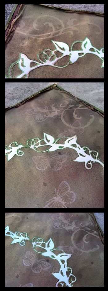
So, the first thing I did was go online and order some Glimmer Mist. I bought 6!!!! Then, I made my own mask using my Pazzles and Prima's felt vines as my inspiration. I cut the template out of a transparency sheet and used Zig thick pen to make it sticky. I also cut a cricut flourish (using my Pazzles :)) to make another mask. I used 3 glimmer mists (Suede, Olive green, and Frost) as well as walnut ink for my background. I then water distressed this layer of paper and matted it with a brown cardstock and finally adhered it on a DCWV green cardstock. The original cardstock was white, as I'm sure you can see by the white 'vines' in the background. I stickled (Eucalyptus) the vines to add some bling to it. The smaller scalloped brown paper is actually the backing of a page stack that I've had for a while. I used my handmade masks and walnut ink to make this paper. I then went over the edges with Scribbles 3D paint (glittering crystal) for an embossed look. I stamped the butterflies (Martha Stewart) in the background with Perfect Medium (by Ranger) and then added perfect pearls to make them stand out.
Here's a picture of my finished background before I added the embellies:
and some close ups:

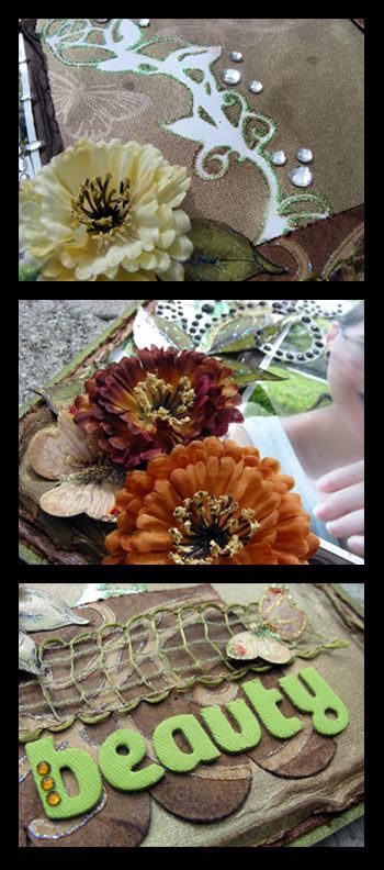
I edited the picture in Photoshop CS4 to give it a more soft and dreamy look using Lisa's tutorial. I can't believe how easy this was! The flowers are from the Fall flower section at Michaels that I bought a few weeks back when they were on sale. The leaves are a stamp and the butterflies were printed and stickled for a blingy look. The black flourish I did with 3D paint (Black) onto a transparency (not my usual way) just to try it out. I like how it came out but I'm not thrilled with the fact that you can see the transparency edges and it took a really long time to cut it up. I think that I like my way more but using a transparency can become useful for when the bling lands on layers of paper, as it is the case with this layout. The green netting in the bottom was a RAK that I received recently. For the title I used thickers that I received from sb.com on NSD.
Here are a few close ups of the layout:

Thanks for stopping by my blog today. I appreciate it!

WOW what an awesome job you did on your background and making your own mask!!!The layout is sooo awesome! Love the Primas you used and the colors are just perfect!
ReplyDeletehugs
Brenda