Here's the first double pager sketch:
and my take:
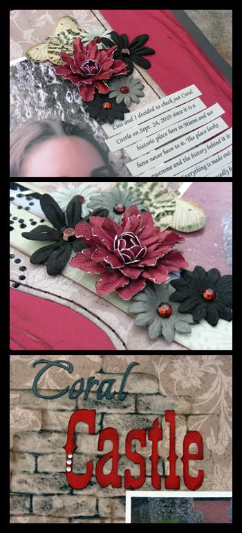
I had a lot of fun with this layout although I must admit that I was very intimidated of it when I first started. The large amount of pictures in the layout scared me since I usually don't add that many to my layouts so I decided to merge a few to form larger pictures. These pictures were taken at Coral Castle, here in Miami, FL during Fall 2010. I love the pictures that we took of this place and the story behind the castle. The red flowers are handmade by me and the title is cut with my pazzles. The brick wall background is actually design in photoshop (by me!) and printed in vellum. I then cut it out and inked the edges. I LOVE how it looks! This layout is very simple but effective (I think so anyway). I actually love the simplicity of it because it lets you focus more on the pics and story.
Here are some close ups:

Here's the second sketch:
and my take:
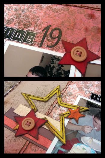
This one was a tough one. I don't normally do boy layouts and though tit would be nice to try to make a layout without any flowers. Big mistake. It took me almost a week to finish this layout even though its so simple! I kept re arranging the elements and playing with colors and this is what came out and I must admit it is growing on me although I hated it when I finished it and almost tossed it. The pictures are of my brother's 19th birthday earlier this year. For the title (turning), I design it in photoshop, printed it and the cut it. For the 19 I used a cuttlebug die cut (yes, I still have my cuttlebug even though I have a pazzles). The stars are chipboard and handmade by me. I used the thick backing of a paper stack to cut them out and then painted them with acrylic paint. The red ones are a cuttlebug die cut. I hand sew the background and the larger star. Using bubble wrap, I inked it to stamp the background to make it a little more distressed since the orange was too strong. I distressed and inked the background layer and finished it off by glimmer misting everything with burnt red glimmer mist. Oh, I forgot to mention that I used TCR palette #32 for this layout.
Here are some close ups:

Thank you so much for stopping over my blog today and taking your time to look!

WOW WOW WOW love your layouts....and that brick wall awesome!!!
ReplyDeletelove the flowers and colors on the top one
the second one lovin the stars and buttons you added and the distressing I need to distress more
Thank you for sharing your beautiful work....you are sooo talented!!!