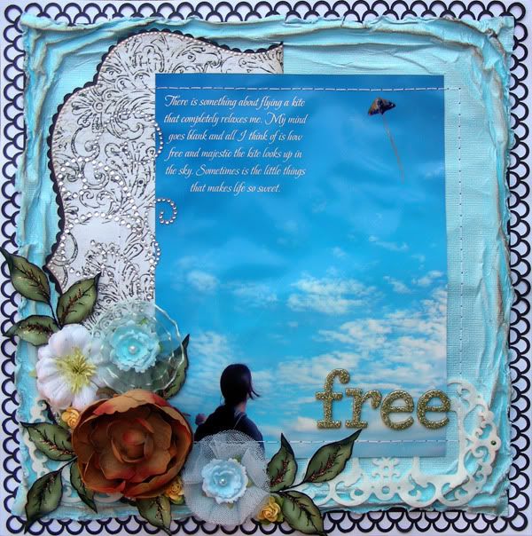
Supplies-cardstock: Bazzill, Core-dinations; patterned paper: My Mind's Eye; chipboard: Thickers; embellishments: Prima Die Cut Felt Art flowers: Prima, Recollections; bling: Zva Creative; ink: Tim Holtz; tools: Martha Stewart punch
This layout looks kind of plain since I used mostly cardstock (black, white and cornblue) and only one pattern paper which happens to be black and white but I like the elegance and simplicity of it . I printed my picture big (8.5"x6.5") and journaled in it before I printed it out. I've always wanted to try this but needed a large picture to fit all journaling (what can I say, I'm a journaler! lol). I entered this layout in Krissy's Journaling Challenge (use a creative way of journaling in your layout). Anyway, I did some water distressing on the blue cardstock and lightly inked the raised edges.

I used Martha Stewart punch around the page and made a black doily for the background. I layered all the cardstocks and attached my picture. I hand-sewed the square around the picture. It took a while to do this but it was absolutely worth it!

I added some Prima blooms that I got recently and a few hand cut leaves with some diamond stickles and a Zva flourish and voila! I love the end product!
Thank you for stopping by today!


I can't see your layout above. I am sure it is beautiful though!
ReplyDeleteThis is not a plain lay out, it is perfect and very very pretty! Love your work!
ReplyDeleteI like the way you did the journaling on the photo. The bling swirl is a nice touch......~Cherrie~
ReplyDelete