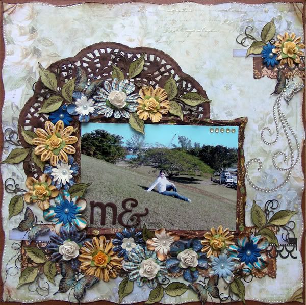
My hubby took this picture of me at the local park on a hill and I love that you can see the background in the picture! For this layout, I used two different colors of Hero Arts blooms-Sunshine and Sea. Now, I wanted to make this layout in more earth tones and these blooms, specially the yellow ones, were a bit bright for my page. My solution?
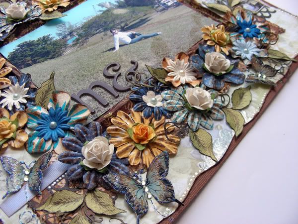
I inked them with Tim Holtz walnut satin ink! Now they all look like they belong in this layout! I used smaller Prima and Recollections roses as flower centers and added Pazzles cut leaves which I sprayed with glimmer mist. As you can see, I ran out of e's so I used the & sign as my e for my title. I really like how it looks!
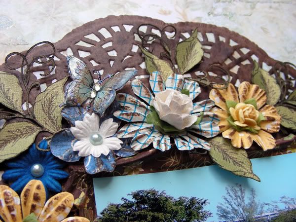
I recolored my white doily from the dollar store using walnut ink-love this stuff! I sprayed several layers and used my blow drying to dry between the coats of ink. I wanted the doily to look very dark so that it would stand out against the light colored Best Creations paper.

Finally, I added another smaller flower cluster on the top right corner of the layout. I finished it off with a butterfly and a Zva bling. I also used a few Hero Arts's rhinestones to accent the butterlfy's body. It gives them a finished and elegant look.
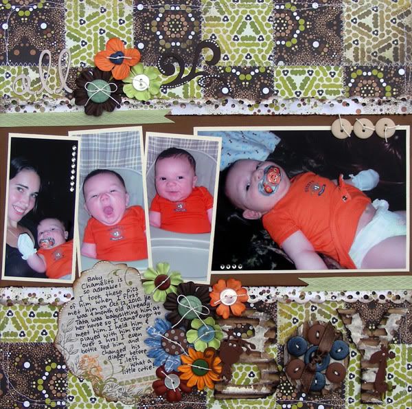
My second layout is a more masculine layout as I used the pictures that I took of my youngest baby cousin back when he was only 1 month old in October. I used my own sketch (sketch_26) for this layout. I rotated the sketch and broke up the picture to include 4 pictures instead of 1. I used only one sheet from the Basic Grey's Origin line of paper and cut it into 2x2 squares. Since they are double sided, I turned every other one upside down and machine stitched them to make a quilt for the background. This is a great way to use those double sided papers since they match already!
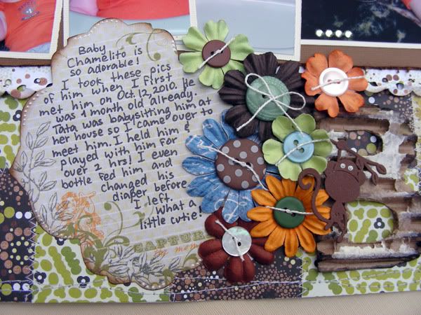
I made a cluster of flowers, some from my stash and some are Hero Arts, and added little buttons to the centers to make them a bit more masculine. Yes, you CAN use flowers in a boy layout! By adding buttons and using masculine colors you can cluster them and use them in boy layouts. I used a Pink Paislee journaling card and hand wrote my journaling about me meeting the baby for the first time.
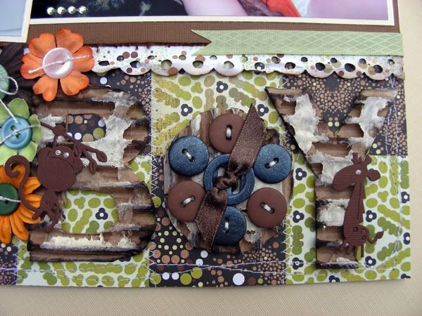
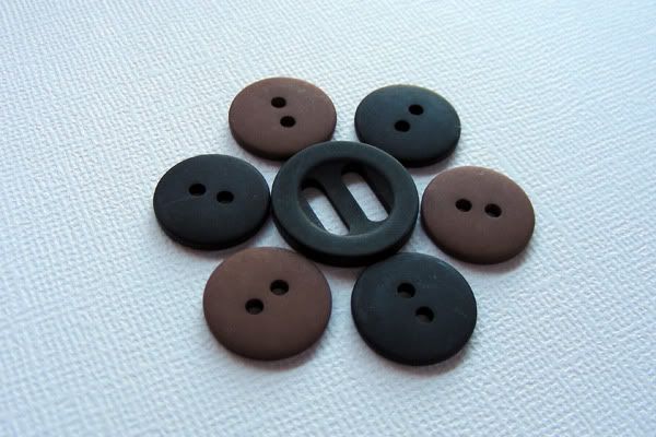
Now, I wanted the title to scream boy-literally! I cut out the letters from a piece of cardboard and distressed them with white paint and Tim Holtz ink. I used 7 buttons to make the letter o. I painted some black button's from Bo Bunny's All Stuck up buttons because the black ones were too harsh for a baby's layout. I used Creative Imaginations' paint-love this stuff that I received as a RAK from my good friend Wendy (thanks Wendy!).
Here is the before and after:
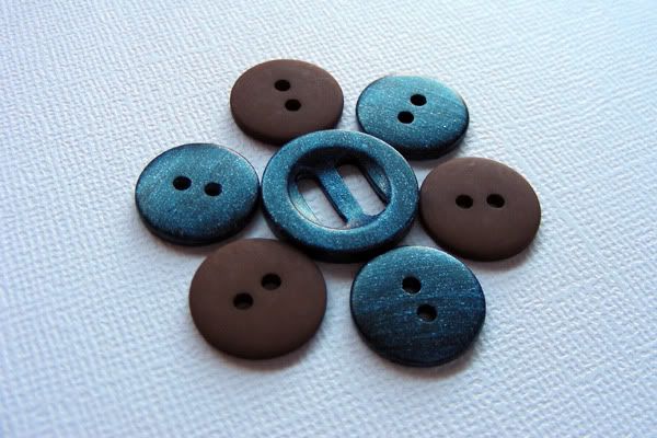
I hand stitched them to the letter o and added some ribbon to the center to finish it off. I used my Cuttlebug to cut out two critters for the other two letters- I love these little animals!
ps. In case you are curious, I used 20 buttons in this layout! :)
Well, my last project is a quick card:
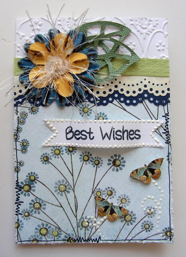
I used my cuttlebug to emboss the background white cardstock-I feel that this step gives any card great elegance! I doodled stitches on the Basic Grey paper and added two layers of Martha Stewart punched cardstock. I layered 2 Hero Arts flowers and made a fiber center to soften the card. The sentiment is by My Pink Stamper and can be used for more than one occasion: Birthdays,Wedding, Graduations, etc.
Thanks you for stopping by today! I appreciate each and everyone of your sweet comments!


Two very gorgeous layouts and one beautiful card.....~Cherrie~
ReplyDeleteJust a quick note to let you know that a link to this post will be placed on CraftCrave today [16 Apr 01:00am GMT]. Thanks, Maria
ReplyDelete