
Do you remember my blog post a few days ago about my Counterfeit Kit? Well, I finally started working on my layouts and if you remember I wanted to make 4 layouts using only 3 sheets of double sided paper. Having said this, I went to my drawing board (photoshop CS4) and designed 4 sketches (and used some of my old sketches) to make my layouts using only these 3 sheets of paper. I cut the designs using my Pazzles Inspiration and this is what I ended up with:

These will be the basic designs of my layouts. Today I'm going to show you how I made the one in the bottom left side.
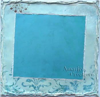
Step 1. I distressed all of my edges and did a whitewash on the outer edge for my background. I always mat my layouts on a white, black or brown cardstock. I used a white cardstock for this layout.
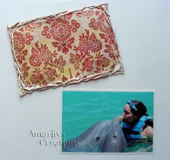
Step 2. I did the same with the photomat. I distressed the edges and did a whitewash. I also printed my photo with a white edge. It saves on paper since I like to mat my photos in white first.
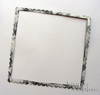
Step 3. Using my Pazzles and the black Bazzill cardstock, I cut out a scallop border and ran some white paint on it using a dry brush. I love this beachy and weathered look!
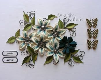
Step 4. I then gathered all of my embellies. I ended up making a few more of those Lili flowers using Lisa's tutorial, this time in blue and cream. I also added some leaves and some little sentiments that I printed on photo paper and cut out. From the kit, I pulled 3 butterflies, 1 Zva bling (not pictured), and the dark blue flower from the Prima package.
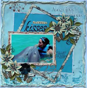
Step 5. I put everything together as you like and voila! The layout is done!
Here are a few close ups of my finished layout:
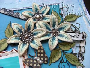
The gorgeous handmade flowers, butterflies and leaves.
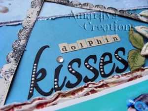
My title and the black whitewash border.
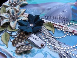
More flowers, butterfly and the bling.
I also used the Counterfeit Kit June Mini Challenge # 1 for inspiration which is to make a layout based on an ad. Here is the ad that I found on google:

I loved the monochromatic and airy feeling of this Downy ad. I used the monochromatic blue and hints of white from the ad as the base of my layout. This is the reason for the whitewash on the edges of the papers and on the black frame.
Thanks for stopping by my blog today. I hope to have inspired you. Don't forget to check back here for the other 3 layouts! I'm having so much fun making these!
Have a great weekend!

Love your flowers - they are beautiful!
ReplyDeleteJust a quick note to let you know that a link to this post will be placed on CraftCrave today [26 Jun 01:00am GMT]. Thanks, Maria
ReplyDeleteBeautiful! I love the blues and how you pull inspiration from the Downy ad.
ReplyDeleteINCREDIBLE!!!!!!!! I need to get an edge distresser BADLY.
ReplyDeleteBeautiful layout! Thanks for sharing your techniques. All your layering and detail work is so pretty. I love your hand made flowers - so lovely.
ReplyDeleteWhat a great way to get the most out of your patterned paper! I love the extreme distressing technique you use, and would love to know how you did it! Beautiful work!
ReplyDeletegreat layout and the flowers are truly gorgeous. great take on the advert and nice clear instructions.
ReplyDeleteLots of pretty touches on this - well done.
ReplyDeleteThis page is just gorgeous! I LOVE your flowers!!
ReplyDelete