Here's the single layout:
The color palette is inspired by Color Combo Galore #164:
and the layout is my take on the left side of Let's Scrap (10-27-10) sketch:
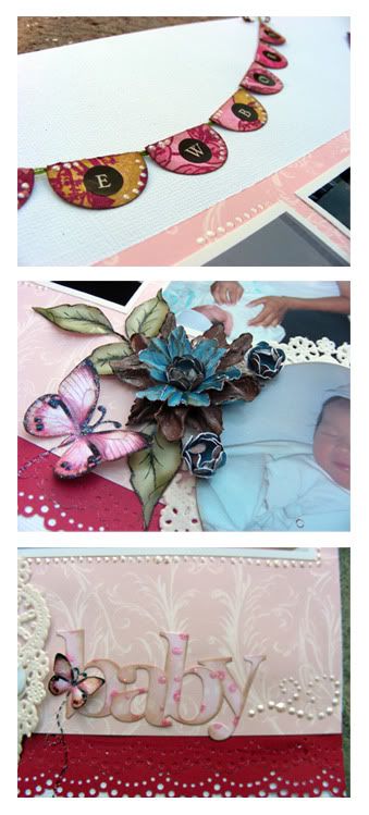
The pink and raspberry color along with the green was a perfect combo for a newborn baby girl layout plus the raspberry color makes my husband's shirt pop out! I used a small doily to mat the round picture and added a handmade blue/brown flower to make the pictures pop since the baby was dressed in neutral blue/green clothes. I handmade the banner by punching out 1" circles and folding them in half. There is hidden journaling behind the main picture on the tag. I colored the green leaves in the olive green to make the contrast between pink and green and I love how it looks!
Here are a few close ups of the handmade items:

The second layout is a double pager inspired by Allison Davis's Sketch for the month of October.
Here's the sketch:
and here's my take:
I found out about Allison Davis and her blog through my scrappy friend Sabrina. I love her clean and simple look and wanted to give it a try. I know that she references Allison Davis a lot so I figured that I'd check out her blog. I love the clean and simple look and since I was working on my 2006 album, back when I didn't have a scrapping style, and most of my layouts were simple anyway, I figured that I would try out one of Allison's sketches for my Thanksgiving layout.
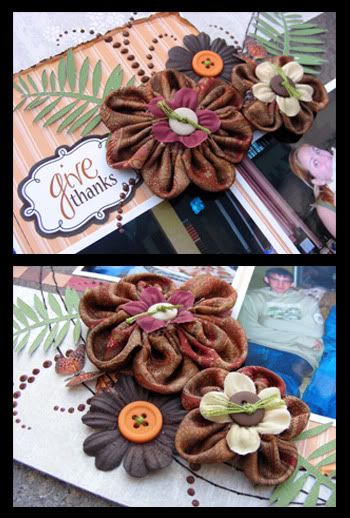
I know that I used a bit of chunky embellies (my handmade fabric flowers) but these were the only flowers that matched a Thanksgiving layout so I had to use them. I tried to keep the layout simple so I just included two embellie clusters and 'filled in' the rest of the page with handstitching, which took forever to finish but I love how it connects the two pages together. Instead of the vertical picture that she asks for in her sketch, I used two horizontal pictures which didn't leave me with enough space in the top for my title so I made this smaller tag-looking title and placed it next to the embellies on the right page. I printed the journaling on vellum to maintain the airy feel of the layout. White cardstock looked to bright and would have crowded that corner. The greenery I cut with my Pazzles. I loved working with this ksetch and the style!
Here are a few close ups of the title and handmade flowers:

Thanks for stopping by! My birthday is coming up (on the 8th of this month!) and I'll be doing something special here on the blog so don't forget to stop by later on the week! Have a wonderful day!

Fabulous work with the sketch and CR!!
ReplyDeleteloveee those flowers you work is sooo amazing!!!!
ReplyDeletehugs
Brenda