Amarilys here with a fun tip for all of you. Today I will show you how you can use a card sketch for a masculine and feminine card as well as a layout!
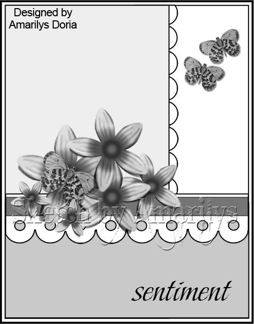
Here is my card sketch:
A masculine card:
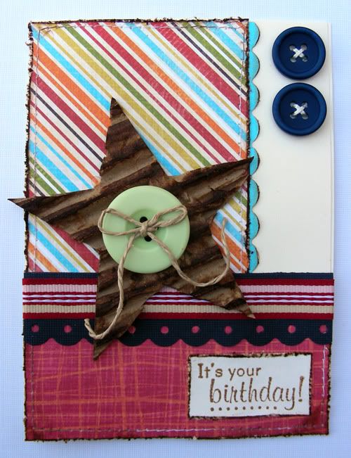
NOTES: To make this masculine birthday card, I replaced the suggested flowers for a hand cut cardboard start and a button, used more masculine colors (bright colors, stripes, etc) and used buttons to replace the suggested butterfly embellies.
and a more feminine card:
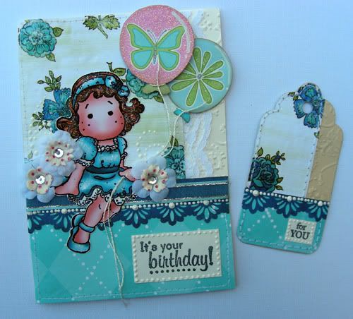
NOTES: For this card, I followed the sketch pretty well. I used a Tilda stamped image as my embellishment cluster and replaced the two butterflies for the balloons that Tilda is holding. I also made a matching tag to go along with this card and notice that even the tag follows the same general design of the sketch!
Finally, here the layout that I came up with using my original card sketch:
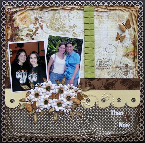
NOTES: I kept the general design of the card sketch, including where the sentiment (in this case, the title) is and just added two pictures above the suggested embellishment area.
For those of you who need a little more of a visual, here is the altered card sketch into a 12x12 sketch:
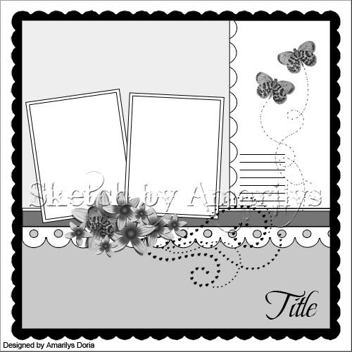
and this is how you use a card sketch for a masculine and feminine card as well as a layout! Hope you enjoyed this tip!


Just a quick note to let you know that a link to this post will be placed on CraftCrave today [17 Jun 12:00am GMT]. Thanks, Maria
ReplyDeleteLOVE your page!The way it looks so layered on the corners is amaizing. And the card is beautiful.
ReplyDeleteGreat sketch!
Hugs
Sueños en Papel
Beautiful and versatile sketch Amy!
ReplyDelete