Today I'm actually sharing a layout I made for a few challenges and not for any of my DTs! I can't remember the last time I did one of these!
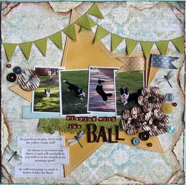
Here's my layout:
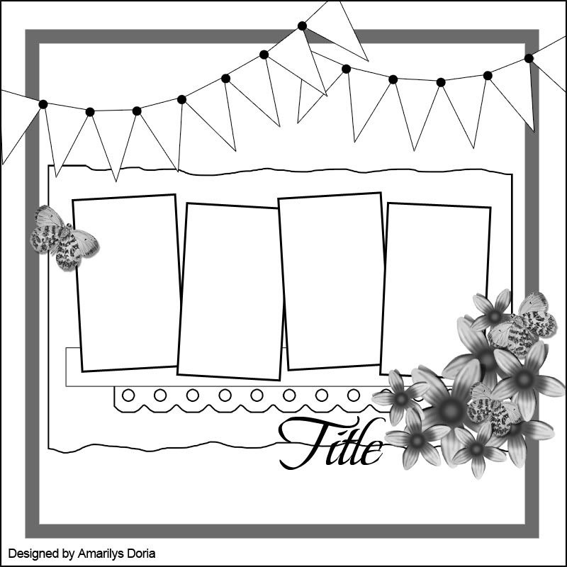
First of all, this layout is based on my sketch below:
I was also inspired by this week's Case File No. 8 over at CSI. CSI is a brand new challenge ning site that not only provides a color challenge but also gets you to tell the store behind the picture(s). If you haven't checked them out yet, stop by and do!
Here is this week's case:

I just loved the masculine colors in this week's challenge and decided to use these colors in a layout about my dog playing with his tennis ball.
EVIDENCE
Use stars : I made a large star die cut shape and used it as my background
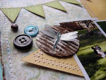
Use glass or transparent elements: I used a transparency sheet to maky the dragonflies’ wings (Here’s a tutorial)
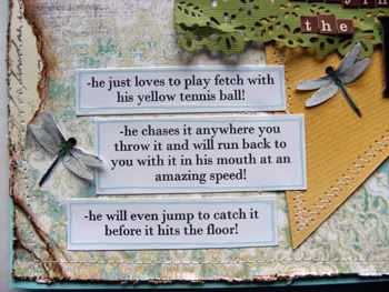
Use liquid mediums: I used Glossy Accents on my journaling strips, paint on my flowers, glimmer mist on the star die cut shape, and ink everywhere! :)
TESTIMONY
Tell three quirky factoids about your subject
Below are some close ups:
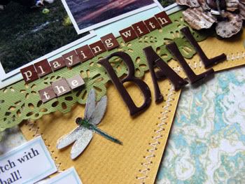
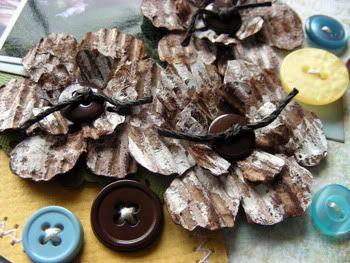
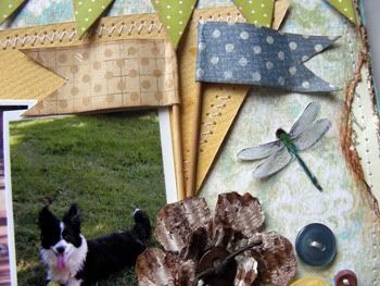
I'm also entering this layout in Flying Unicorn's Feb Pet challenge.
Thanks for stopping by my blog today! I really appreciate it! :)


thank you for always being so innovative and inspiring. You keep making me want to try new things and scrap til I drop
ReplyDeletegorgeous layout Amy...love the colors and that was a hard palette for me
ReplyDelete